Difference between revisions of "BlackBerry Concepts"
(→BlackBerry Development Fundamentals using Eclipse IDE) |
(UI comp) |
||
| Line 175: | Line 175: | ||
</source> | </source> | ||
|} | |} | ||
| + | |||
| + | ---------- | ||
| + | |||
| + | === Basic UI Elements - Package ''net.rim.device.api.ui.component'' === | ||
| + | |||
| + | {| class="wikitable" border="0" cellpadding="6" | ||
| + | ! Class Name !! Description | ||
| + | |- | ||
| + | |+ | ||
| + | |- | ||
| + | | ActiveAutoTextEditField || Field that uses a supplied set of string patterns to pick out 'active' regions. | ||
| + | |- | ||
| + | | ActiveFieldContext || An instance of this class is passed into factories that createActiveFieldCookie instances. | ||
| + | |- | ||
| + | |ActiveRichTextField || Field that uses a supplied set of string patterns to scan through a simple text string and pick out "active" regions. | ||
| + | |- | ||
| + | |AutoCompleteField || AutoCompleteField lets you create a text field that presents users with a changing list of words that are associated with the characters they have typed in the field. | ||
| + | |- | ||
| + | |AutoTextEditField || An editable text field designed to provide autotext support. | ||
| + | |- | ||
| + | |BasicEditField || An editable simple text field with no formatting. | ||
| + | |- | ||
| + | |BitmapField || | ||
| + | Displays a bitmap. | ||
| + | |- | ||
| + | |ButtonField || | ||
| + | Contains a button control. | ||
| + | |- | ||
| + | |ButtonFieldFactory || | ||
| + | Assists in creation of ButtonField instances using information contained within Command instances. | ||
| + | |- | ||
| + | |CheckboxField || | ||
| + | Contains a checkbox control. | ||
| + | |- | ||
| + | |ChoiceField || | ||
| + | Base implementation of a choice field. | ||
| + | |- | ||
| + | |DateField || | ||
| + | Stores date and time values. | ||
| + | |- | ||
| + | |Dialog || | ||
| + | Provides a dialog box with predefined configurations. | ||
| + | |- | ||
| + | |EditField || | ||
| + | An editable simple text field with no formatting. | ||
| + | |- | ||
| + | |EmailAddressEditField || | ||
| + | An editable text field designed specifically to handle internet email addresses. | ||
| + | |- | ||
| + | |GaugeField || | ||
| + | Displays a horizontal bar that you can use for numeric selection or as a progress indicator. | ||
| + | |- | ||
| + | |KeywordFilterField || | ||
| + | Consists of a single keyword input field and a list of selectable elements. | ||
| + | |- | ||
| + | |LabelField || | ||
| + | Contains a simple label. | ||
| + | |- | ||
| + | |ListField || | ||
| + | Contains rows of selectable list items. | ||
| + | |- | ||
| + | |Menu || | ||
| + | Provides a Menu. | ||
| + | |- | ||
| + | |NullField || | ||
| + | A field of no size. | ||
| + | |- | ||
| + | |NumericChoiceField || | ||
| + | A choice field that supports choosing from a range of numeric values. | ||
| + | |- | ||
| + | |ObjectChoiceField || | ||
| + | Choice field that supports a list of object choices. | ||
| + | |- | ||
| + | |ObjectListField || | ||
| + | List field to contain a list of objects. | ||
| + | |- | ||
| + | |PasswordEditField || | ||
| + | An editable text field designed specifically to handle password input. | ||
| + | |- | ||
| + | |RadioButtonField || | ||
| + | Field to provide a radio-button control. | ||
| + | |- | ||
| + | |RadioButtonGroup || | ||
| + | Groups a set of related radio button fields. | ||
| + | |- | ||
| + | |RichTextField || | ||
| + | Read-only field that supports richly formatted text. | ||
| + | |- | ||
| + | |SeparatorField || | ||
| + | A field which draws a horizontal line across its width. | ||
| + | |- | ||
| + | |SpinBoxField || | ||
| + | A user interface component for selecting a single item from a list where the user can spin through the various choices. | ||
| + | |- | ||
| + | |StandardTitleBar || | ||
| + | Provides a standard title bar component with a standard set of optional title bar components and indicators. | ||
| + | |- | ||
| + | |Status || | ||
| + | Simple dialog to show ongoing status. | ||
| + | |- | ||
| + | |TextField || | ||
| + | A simple editable text field. | ||
| + | |- | ||
| + | |TextSpinBoxField || | ||
| + | A SpinBoxField that renders text. | ||
| + | |- | ||
| + | |TitleBar || | ||
| + | Provides an abstract TitleBar component. | ||
| + | |- | ||
| + | |TreeField || | ||
| + | A simple field to show a tree structure. | ||
| + | |} | ||
| + | |||
---------- | ---------- | ||
Revision as of 13:14, 22 February 2011
Main Page · Course Description · Course Topics · Schedule, Students, Teams · Course Resources · Course Projects
BlackBerry Development Fundamentals using Eclipse IDE
This is a practical introduction to build BlackBerry applications.
(modified based on Alan Wong - January 13, 2011 presentation).
| Steps | Actions |
|---|---|
| The steps to install, configure and check your installation are defined at: Install, Configuration, Check section. | |
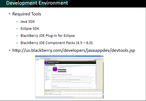
| One can download the software for developing BlackBerry applications using Eclipse from: BlackBerry Java Plug-in for Eclipse
Note: You have to register as a developer prior to downloading process | |
The goals of the Project is to create basic Java code that has the capabilities to:
|
Configuring the Project
| Steps | Actions |
|---|---|
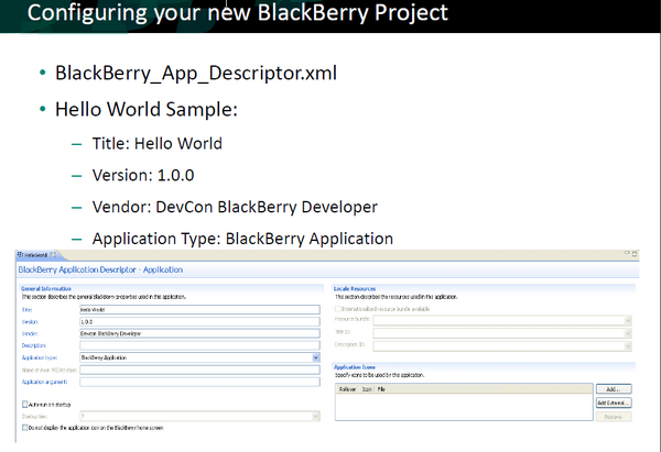
<Properties ModelVersion="1.1.2">
  <General Title="Hello World Demo" Version="0.9" Vendor="Research In Motion Ltd." Description=""/>
  <Application Type="BlackBerry Application" MainMIDletName="" MainArgs="" HomeScreenPosition="0" StartupTier="7" IsSystemModule="false" IsAutostartup="false"/>
  <Resources hasTitleResource="false" TitleResourceBundleName="" TitleResourceBundleRelativePath="" TitleResourceBundleClassName="" TitleResourceBundleKey="" DescriptionId="">
    <Icons>
      <Icon CanonicalFileName="res\img\helloworld_jde.png" IsFocus="false"/>
    </Icons>
  </Resources>
  <Compile OutputCompilerMessages="false" ConvertImages="true" CreateWarningForNoExportedRoutine="true" CompressResources="false">
    <PreprocessorDefines/>
  </Compile>
  <Packaging OutputFileName="HelloWorldDemo" OutputFolder="deliverables" PreBuildStep="" PostBuildStep="" CleanStep="" GenerateALXFile="true">
    <AlxFiles/>
  </Packaging>
  <HiddenProperties>
    <ClassProtection/>
    <PackageProtection/>
  </HiddenProperties>
  <AlternateEntryPoints/>
</Properties> | |
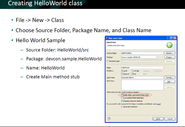
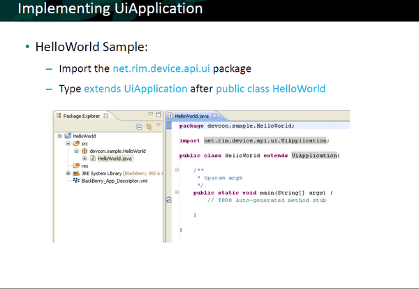
| This class extends the UiApplication class, providing a graphical user interface. | |
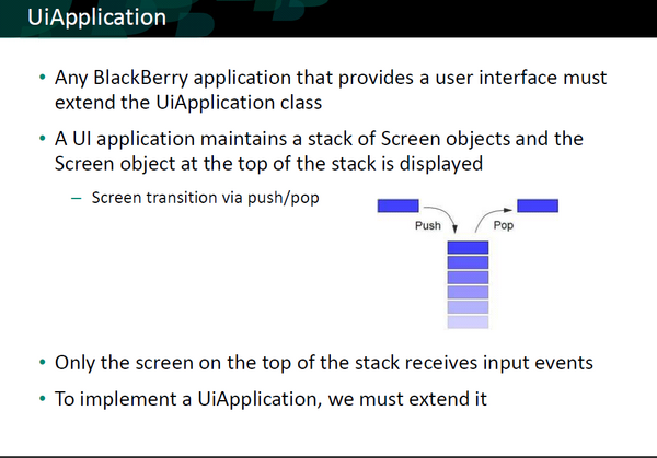
| UiApplication
Base class for all device applications that provide a user interface.
As it pushes screens onto the stack, it draws them on top of any other screens already on the stack. When the application pops a screen off the stack, it redraws the underlying screens as necessary. Only the screen on the top of the stack receives input events.
The application throws a runtime exception if you attempt to push a single screen onto the stack more than once. Note that a UI application must follow rules similar to those of traditional Swing applications. |
Development Fundamentals
| Steps | Actions |
|---|---|
| Package net.rim.device.api.ui
Provides fundamental functionality for constructing the user interface of a RIM Device application. The members of this package are all abstract classes or interfaces They are not intended for direct instantiation. You should rather use (or extend) the classes in net.rim.device.api.ui.component and net.rim.device.api.ui.container. import net.rim.device.api.ui.UiApplication;
/**
* This class extends the UiApplication class, providing a graphical user
* interface.
*/
public class HelloWorldDemo extends UiApplication {
/** | |
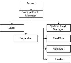
| There are three main UI primitives:
Screen class is the base class for all screens. Each UiEngine presents an interface to the user by pushing screens onto its display stack, and popping them off when interaction with the managed fields on that screen is finished. Delegate manager Each screen object has a delegate manager, the single Manager object directly controlled by the screen to handle layout and scrolling for the entire screen. | |
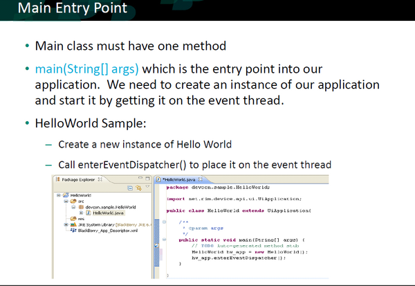
| enterEventDispatcher
The thread that calls this method (typically the main thread in the application) becomes theevent-dispatching thread, which will execute all drawing and event-handling code. Note: under normal circumstances this method does not return. public class HelloWorldDemo extends UiApplication {
/**
* Entry point for application
* @param args Command line arguments (not used)
*/
public static void main(String[] args) {
// Create a new instance of the application and make the currently
// running thread the application's event dispatch thread.
HelloWorldDemo theApp = new HelloWorldDemo();
theApp.enterEventDispatcher(); | |
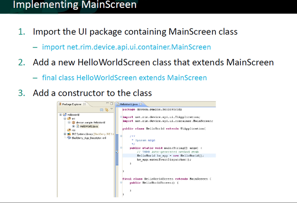
| Class MainScreen
The MainScreen class defines the full screen providing features common to standard RIM device applications. /**
* A class extending the MainScreen class, which provides default standard
* behavior for BlackBerry GUI applications.
*/
final class HelloWorldScreen extends MainScreen {
| |
|
final class HelloWorldScreen extends MainScreen {
    /**
     * Creates a new HelloWorldScreen object
     */
    HelloWorldScreen() {
        // Set the displayed title of the screen
setTitle("Eclipse Course"); |
Basic UI Elements - Package net.rim.device.api.ui.component
| Class Name | Description |
|---|---|
| ActiveAutoTextEditField | Field that uses a supplied set of string patterns to pick out 'active' regions. |
| ActiveFieldContext | An instance of this class is passed into factories that createActiveFieldCookie instances. |
| ActiveRichTextField | Field that uses a supplied set of string patterns to scan through a simple text string and pick out "active" regions. |
| AutoCompleteField | AutoCompleteField lets you create a text field that presents users with a changing list of words that are associated with the characters they have typed in the field. |
| AutoTextEditField | An editable text field designed to provide autotext support. |
| BasicEditField | An editable simple text field with no formatting. |
| BitmapField |
Displays a bitmap. |
| ButtonField |
Contains a button control. |
| ButtonFieldFactory |
Assists in creation of ButtonField instances using information contained within Command instances. |
| CheckboxField |
Contains a checkbox control. |
| ChoiceField |
Base implementation of a choice field. |
| DateField |
Stores date and time values. |
| Dialog |
Provides a dialog box with predefined configurations. |
| EditField |
An editable simple text field with no formatting. |
| EmailAddressEditField |
An editable text field designed specifically to handle internet email addresses. |
| GaugeField |
Displays a horizontal bar that you can use for numeric selection or as a progress indicator. |
| KeywordFilterField |
Consists of a single keyword input field and a list of selectable elements. |
| LabelField |
Contains a simple label. |
| ListField |
Contains rows of selectable list items. |
| Menu |
Provides a Menu. |
| NullField |
A field of no size. |
| NumericChoiceField |
A choice field that supports choosing from a range of numeric values. |
| ObjectChoiceField |
Choice field that supports a list of object choices. |
| ObjectListField |
List field to contain a list of objects. |
| PasswordEditField |
An editable text field designed specifically to handle password input. |
| RadioButtonField |
Field to provide a radio-button control. |
| RadioButtonGroup |
Groups a set of related radio button fields. |
| RichTextField |
Read-only field that supports richly formatted text. |
| SeparatorField |
A field which draws a horizontal line across its width. |
| SpinBoxField |
A user interface component for selecting a single item from a list where the user can spin through the various choices. |
| StandardTitleBar |
Provides a standard title bar component with a standard set of optional title bar components and indicators. |
| Status |
Simple dialog to show ongoing status. |
| TextField |
A simple editable text field. |
| TextSpinBoxField |
A SpinBoxField that renders text. |
| TitleBar |
Provides an abstract TitleBar component. |
| TreeField |
A simple field to show a tree structure. |
