Difference between revisions of "GPU621 Team 1"
Tai Nguyen (talk | contribs) (→VTune Tutorial 2: Locks and Wait Tutorial) |
(→Where To Get Vtune ?) |
||
| Line 18: | Line 18: | ||
| − | [https://software.intel.com/en-us/intel-vtune-amplifier-xe/try-buy Download Here] | + | [https://software.intel.com/en-us/intel-vtune-amplifier-xe/try-buy Download Vtune Here] |
== Getting Started == | == Getting Started == | ||
Revision as of 11:00, 1 December 2016
Contents
What is VTune Amplifier?
Application that apply different analysis to your program
Helps programmer debugs and improve program
Provide GUI version
It has both a standalone and a IDE add-on
Where To Get Vtune ?
Price: $899
Window / Linux
Free Software Tools
- Students
- Educators
- Academic researchers
- Open source contributors
Download Vtune Here
Getting Started
VTune Tutorial 1: Finding HotSpot
This example program will be downloaded when you install VTune Amplifier. Following is the directory that contain the sample code from Intel.
[Program Files]\IntelSWTools\VTune Amplifier XE <version>\samples\en\C++\tachyon_vtune_amp_xe.zip
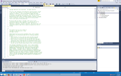
Open the project using Visual Studio. Then you can run the the VTune Amplifier and click new Analysis. (You need to download Vtune Amplifier to have that tab on Visual Studio)
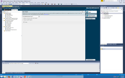
This should be the next page you will get. You begin to choose different type of Analysis here. We are going do a Basic Hotpots Analysis.Then click start to start the Analysis.
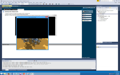
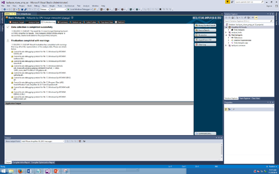
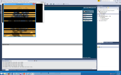
The program should run itself after you begin.You will notice that the image is loading from the bottom to the top. After the program finish running, it will take a while for Amplifer to generate report.
After the program finish running, it will take a while for Amplifer to generate report.
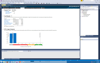
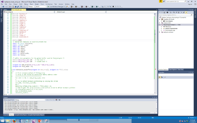
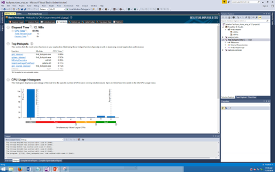
The first page will shows a summary of the program.The time it took, the top hotspots, CPU usage etc. We will focus looking at the Hotspots table. we notice that the "initialize_2D_buffer" use the most the CPU time. If you look at the code on find_hotspots.cpp you will notice it is actually one function in side that cpp file
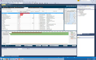
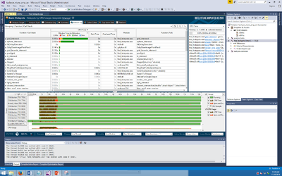
We go to the bootom up tab. it will give you a graph that shows the Hotspots table you got. You can clearly see that "initialize_2D_buffer" use the most time compare to the other function.
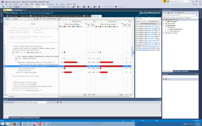
If we double click on this function we it will shows the sources code and shows you which line of the code actually use the most time in the specific function. Now we can tell that most of the time are spend on the while loop.
To compare a paralleled version of this code I already have a program that use CILK PLUS to parallelize that program. Below is the link to download that code. Simply replace the find_hotspots.cpp with this code, build it and run the Analysis again.
Link:File:Find hotspots.zip
When you run the Analysis this time you will see the program image load at the same time in different level instead of loading from the bottom to the top.
This time we should able to see that the Elased Time is shorter than the old time about 10second and the Top Hotspot is no longer "initialize_2D_buffer".
If we go to bottom up tab you can see that the "initialize_2D_buffer" is no longer exist and it shows the Cilk worker graph that shows the program is not run a parallel.
VTune Tutorial 2: Locks and Wait Tutorial
1. Prepare for Analysis
Note: configuration step is skipped and using default application configuration.
Determine the baseline (total execution time which you will compare subsequent runs of the application).
Do this by running the application for the first time.
After running the application, the baseline for the first run is 6.063s.
2. Find lock
2a. Choose and run locks and waits analysis:
With visual studio, click on "new analysis".
Choose your analysis target (the application executable).
Click on the Analysis Type tab. Under algorithm analysis, click on "Locks and Waits" and click start to run the analysis.
Click on the Analysis Type tab. Under algorithm analysis, click on "Locks and Waits" and click start to run the analysis.
You should see the Locks and Waits viewport and the summary of the results.
2b. Interpret result data:
To interpret the data on the sample code performance, do the following:
1. Analyze the basic performance metrics. 2. Identify locks.
Analyze the basic performance metrics:
The Result summary section provides data on the overall application performance per the following metric:
1.) Elapsed Time is the total time the application ran, including data allocation and calculations
2.) Wait Time occurs when software threads are waiting due to APIs that block or cause synchronization. Wait Time is calculated per thread, so the total wait time may exceed the application Elapsed time. Expand the wait time metric to view a distribution per processor utilization level. In the sample application, most of the Wait time is characterized with an ineffective processor usage.
3.) Wait Count is the overall number of times the system wait API was called for the analyzed application.
4.) Spin Time is the time a thread is active in a synchronization construct; the current value exceeds the threshold, so it classified as a performance issue and highlighted in pink.
5.) CPU Time is the sum of CPU time for all threads.
6.) Total Thread Count is the number of threads in the application.
7.) Paused Time is the amount of Elapsed time during which the analysis was paused via GUI, CLI commands, or user API.
For the analyze_locks application, the Wait time is high, to identify the cause you need to understand how this Wait time was distributed per synchronization objects.
The Top Waiting Objects section provides the list of synchronization objects with the highest Wait Time and Wait Count, sorted by the Wait Time metric.
For the analyze_locks application, focus on the first three objects and explore the Bottom-up pane for more details.
The Thread Concurrency Histogram represents the Elapsed time and concurrency level for the specified number of running threads. Ideally, the highest bar of your chart should be within the OK or Ideal utilization range.
Note the Target Concurrency value. By default, this number is equal to the number of physical cores. Consider this number as your optimization goal.
For the sample code, the chart shows that analyze_locks is a multithreaded application running maximum 4 threads simultaneously on a machine with 4 cores. But it is not using available cores effectively.
Hover over the second bar to understand how long the application ran serially. The tooltip shows that the application ran one thread for almost 6.611 seconds, which is classified as Poor concurrency.
The CPU Usage Histogram represents the Elapsed time and usage level for the logical CPUs. Ideally, the highest bar of your chart should be within the Ok or Ideal utilization range.
